Aleksi Mäntykivi
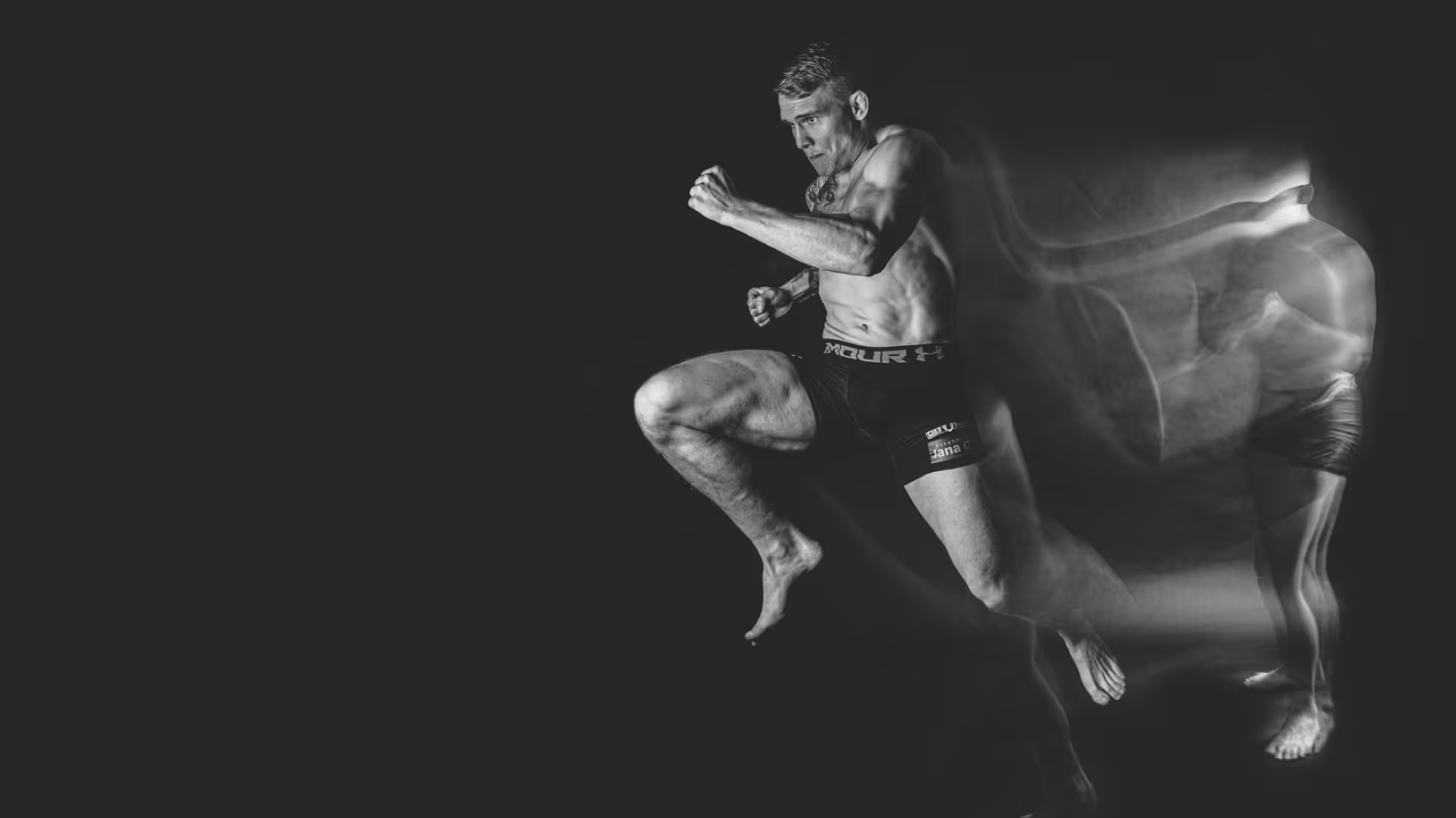
The name that had to hold its own
Aleksi Mäntykivi competes in a visual space already full of noise. Every sponsor, every promoter, every media brand is fighting for attention in the same frame. In that context, a personal brand cannot afford to be subtle, but it also cannot afford to be generic.
When Aleksi came to Studio Hakola, the question was not whether he needed a brand. It was whether the brand would actually reflect the person wearing it.
What the room already knew
Aleksi is not the fighter who manufactures a persona. He is relaxed, genuine, fair, and then completely relentless when the moment demands it. His Finnish roots are not incidental to this. There is a particular quality in Finnish sports culture, a groundedness and a lack of ego that sits in productive tension with the spectacle of combat sports.
That tension was not a problem to solve. It was the most interesting thing about him. The brand had to hold both truths at once, and do it without flattening either.
The work
Before anything visual could be decided, the work started with an honest picture of who Aleksi actually is and what his brand needed to stand for. The key definers were not invented. They were extracted from how the people around him already described him: fair, grounded, a gentleman in the room and relentless in the fight. In a sport where persona is often manufactured for effect, that authenticity was the most valuable thing the brand had. The work was about protecting it.
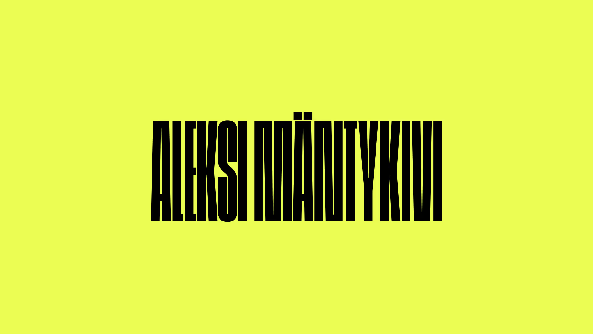
From that foundation, the visual direction was built to reflect a quality of character that does not move under pressure. Win or lose, the person remains. That became the organising principle: not a style choice but a position. A mark that occupies space without aggression, that holds its own alongside the major sponsor brands in his world without competing with them, and that reads as a professional at the level he is competing to reach.
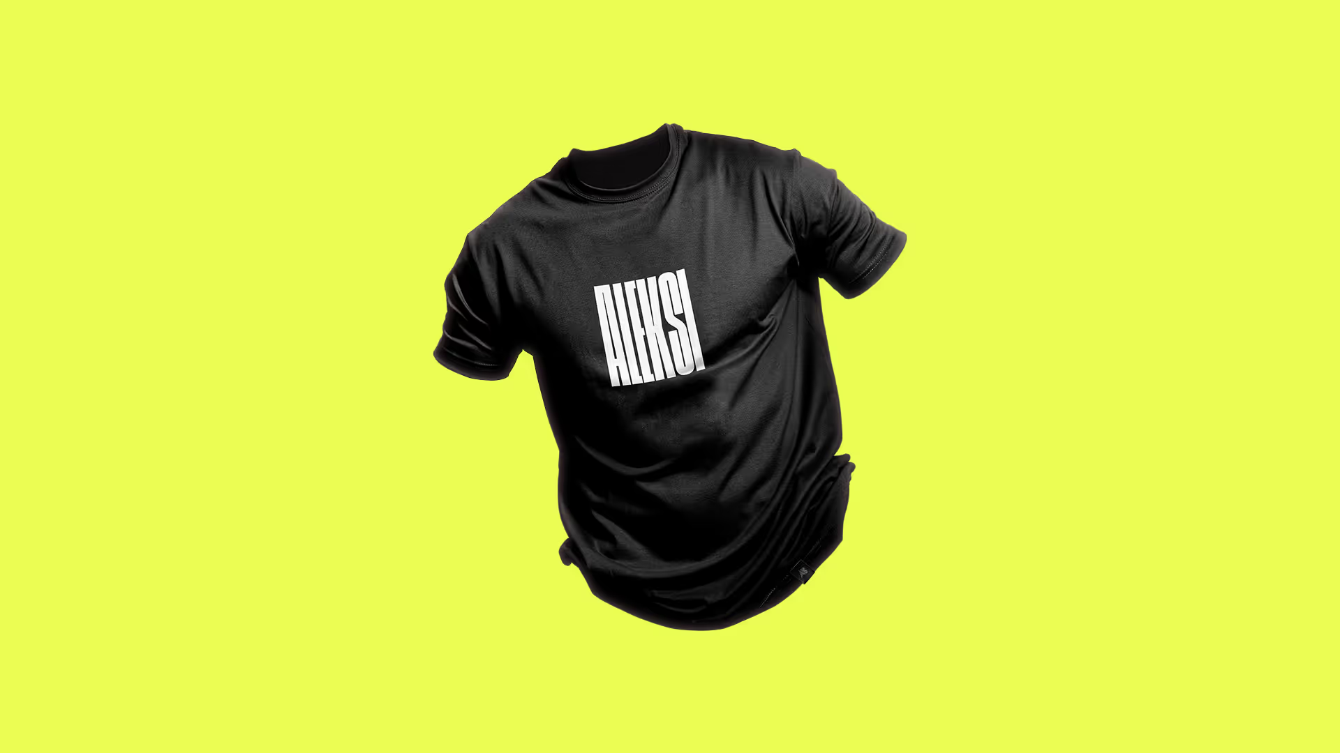
The identity was extended across every surface where it would need to live, because a fighting brand does not get to exist only in one context. It has to function in the arena and outside it, on kit and on screen, at the moment of competition and in every conversation that follows.
The name travels now
Aleksi Mäntykivi is a ranked professional MMA fighter competing across Europe. The visual identity he carries into that environment holds the same weight as the brands sponsoring the events around him.
A fighting career is long. The brand built around it needed to be the kind that grows with the person rather than dates with the moment. What Aleksi has now is a mark that will hold its own at every level he reaches, because it was never built around where he was. It was built around who he is.



Start here if you're not sure.
Most people arrive thinking they need a logo, a new website, or better copy. Something visible and fixable. A logo built on unclear positioning is just a shape. A website built before the messaging is resolved is just an expensive page.
The surface stuff shows. But the surface stuff isn't the problem.