IDA+S
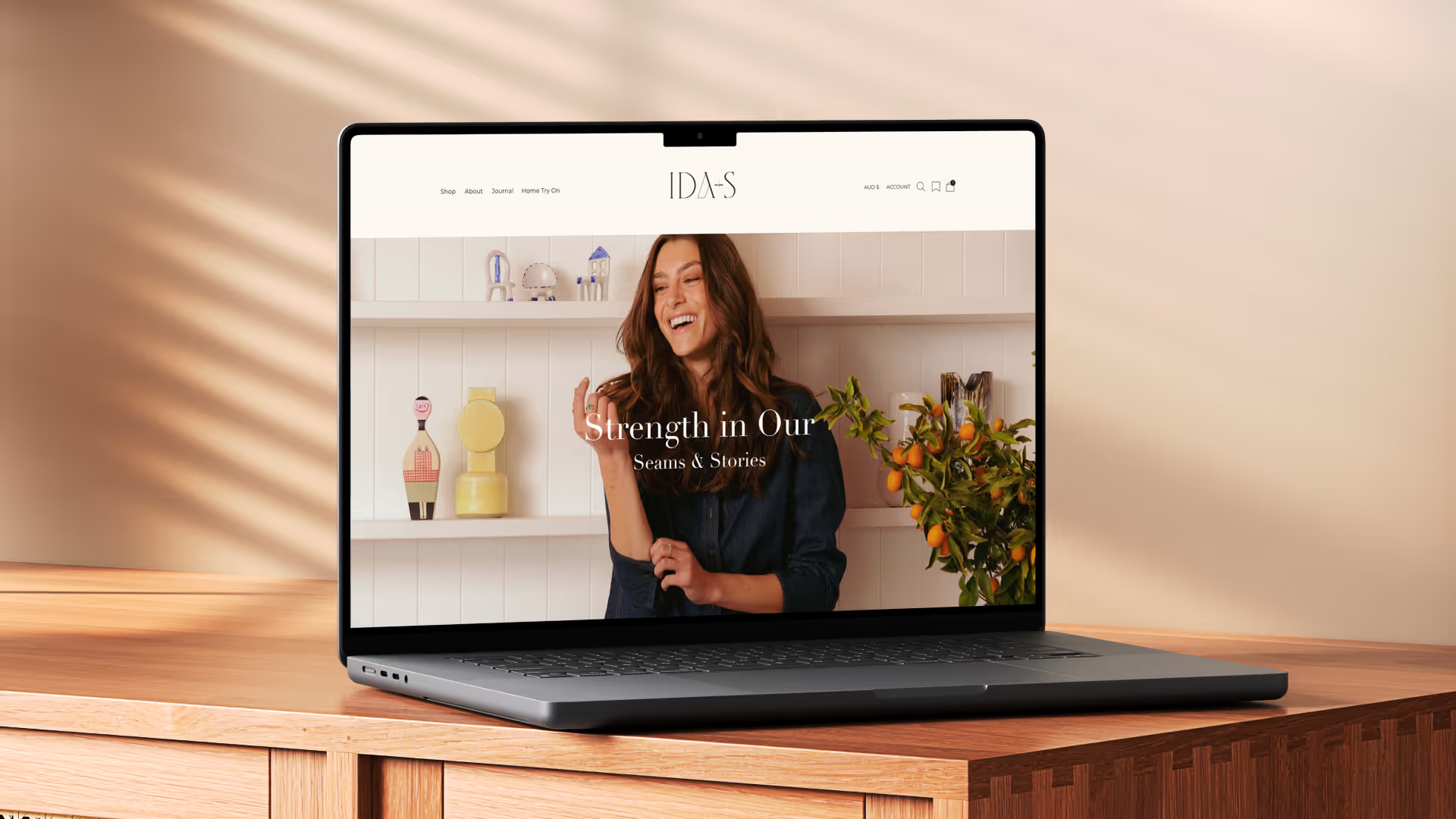
The story was extraordinary. The work was making sure it travelled.
IDA+S arrived with something most brands spend decades trying to manufacture: a founding story with real weight. Built on a legacy of luxury fashion, ethical manufacturing, and a commitment to community that predates the brand itself, it was never going to be a simple market entry.
At the centre of it is Ida. A life marked by hardship, resilience, and extraordinary generosity. A woman who built something significant and inspired her son Kinsen, and his wife Louise, to build something worthy of her name.
That is the brand. The work was making sure it travelled.
A brand at an inflection point
IDA+S entered the Australian market with exceptional product credentials and a founding narrative that could genuinely move people. What it lacked was the infrastructure to translate that into consistent, commercially effective communication.
The positioning existed in fragments: a redemptive fashion philosophy, a sustainability story that was lived rather than performed, a factory-direct model no competitor could replicate. Without a shared language, a clear picture of who the customer was, or a framework that connected values to behaviour across every touchpoint, the story kept flattening into generic messaging that looked like everyone else.
The work
The first task was giving the brand a shared language. IDA+S had accumulated real substance across manufacturing, community, and founder story, but without a clear hierarchy, every communication decision became a negotiation. The work brought that into focus: what the brand stood for, how it spoke, and why that mattered to the specific women it was built for.
Understanding those women properly changed what was possible. Not who they were on paper, but what they were actually weighing when they made a purchase, what earned their trust, and what made them stay. Three distinct profiles, each with her own psychology and her own entry point. That clarity became the filter through which every subsequent decision was made.
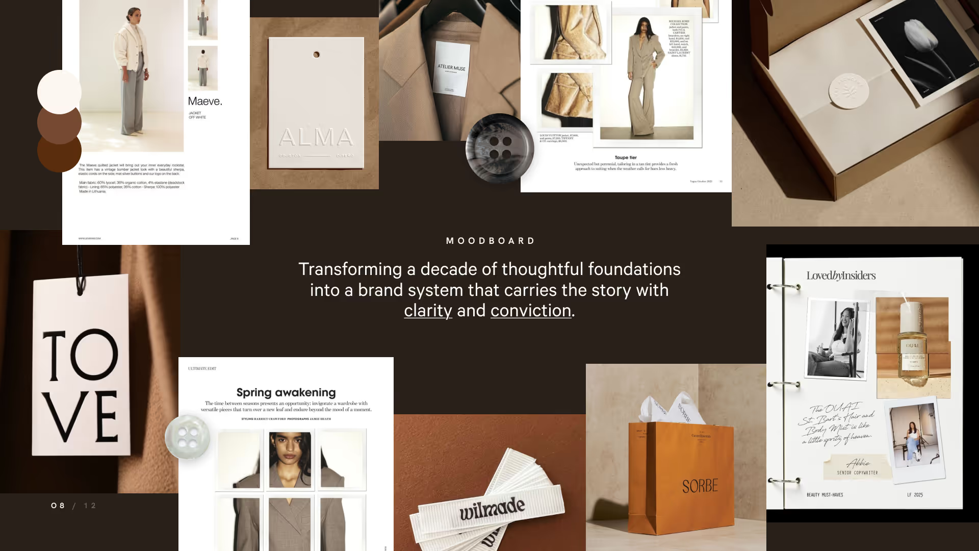
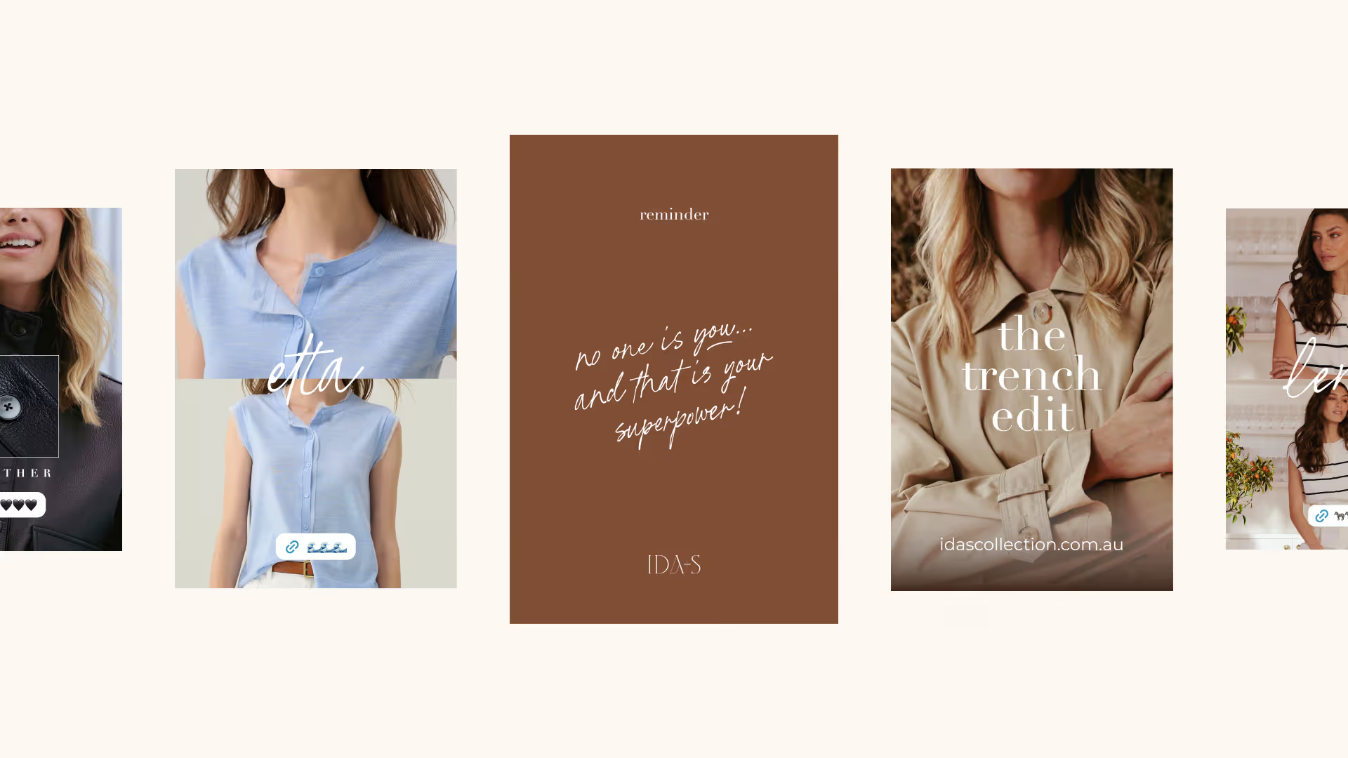
From there, the work mapped every surface the brand touched. The social and content direction moved beyond individual post ideas into a complete content architecture: a framework that connected the brand's values and story to how the product was presented, styled, and contextualised across every channel. The goal was content that felt like IDA+S rather than content that looked like the rest of the market.
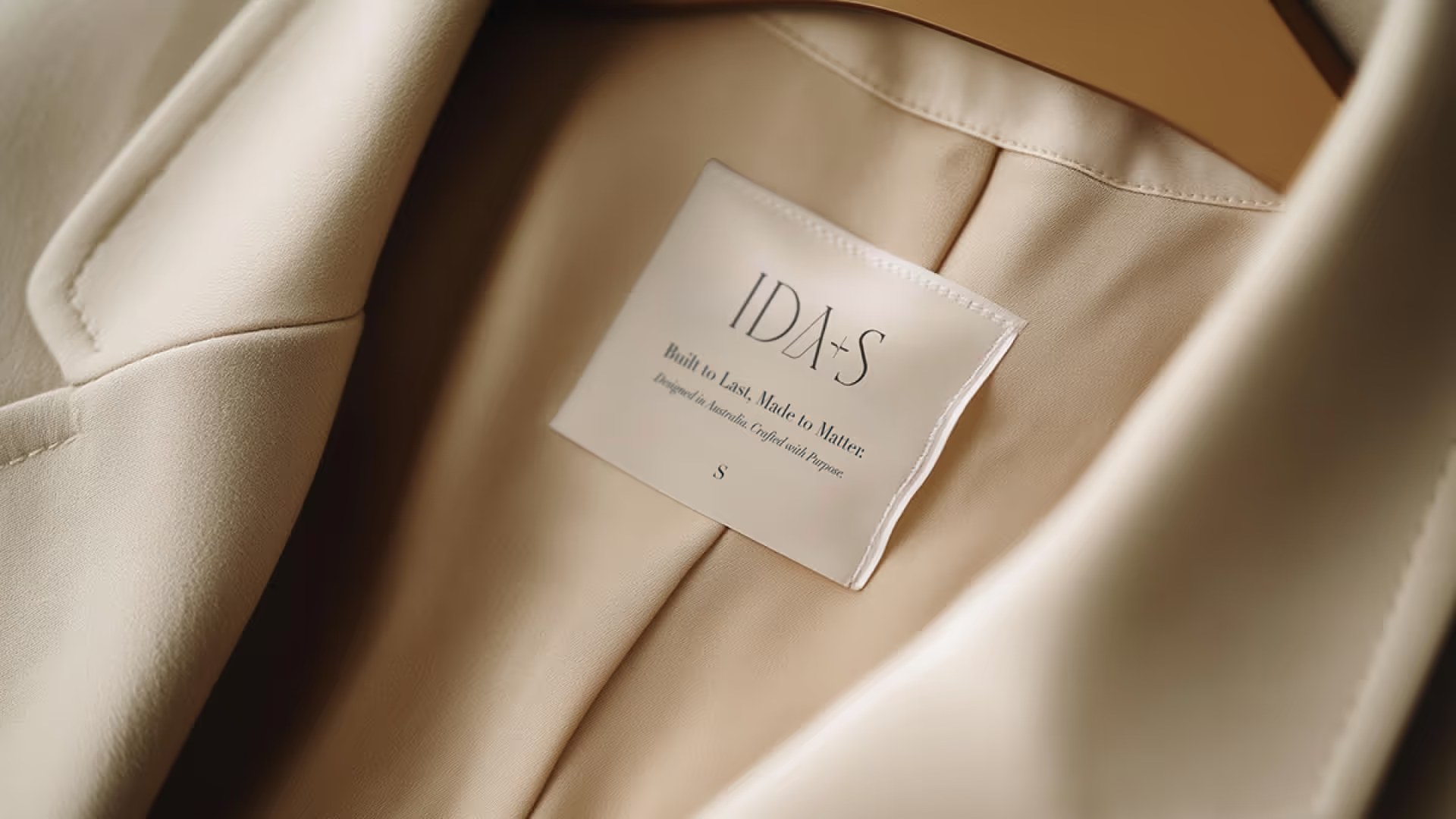
The physical experience was considered just as deliberately. Every analogue touchpoint was reviewed: garment labels, hang tags, custom coathangers, unboxing, shipping, and retail. Showroom direction extended beyond the visual into the sensory, because the brands people remember longest are the ones that engage more than just the eye.
The goal was a brand that didn't just look consistent but felt consistent, at every point of contact.
A brand equipped to be exactly what it already was
IDA+S came into this engagement with rare substance and two founders who knew precisely what they stood for. What the work built was the system to make that visible and consistent at every level, from a brand keyword to a window display.
The voice is defined not by rules but by a clear understanding of what the brand owes its audience: truth, specificity, and enough depth to matter. The personas are live decision tools. The physical touchpoints put everything into the hands of the people the brand was made for.
What IDA+S is now equipped to do is compete on the one thing Australian fashion has very few examples of: a story that is irreplaceable because it is completely true.

Start here if you're not sure.
Most people arrive thinking they need a logo, a new website, or better copy. Something visible and fixable. A logo built on unclear positioning is just a shape. A website built before the messaging is resolved is just an expensive page.
The surface stuff shows. But the surface stuff isn't the problem.