Outback
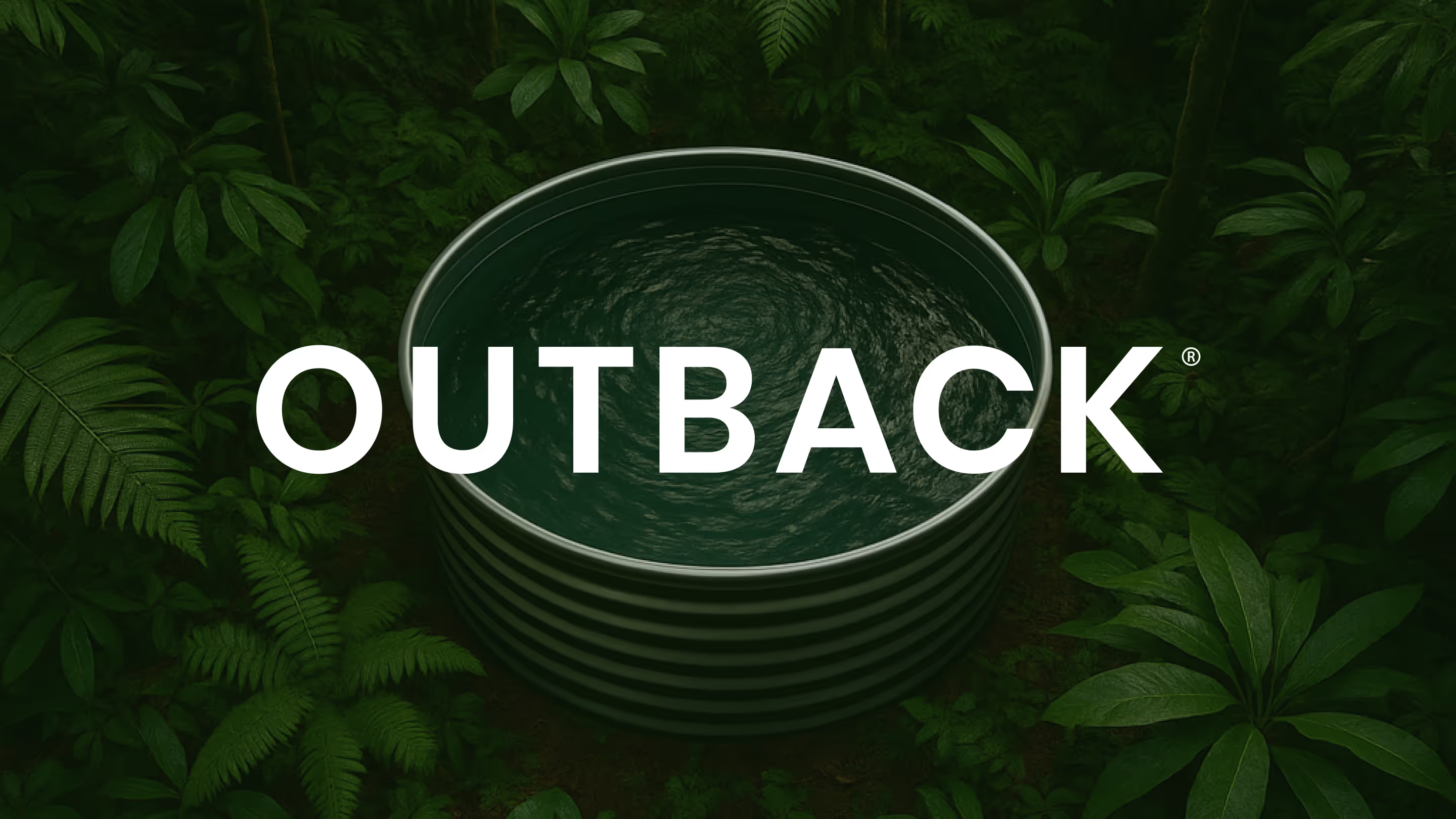
The original. Now with proof to match.
Outback had built something worth leading with. As the pioneers of the circular plunge pool category in Australia, they had four years of product refinement, a growing customer base, and a clear sense of where the business was heading. The product was proven, the reputation was real, and the vision for the next stage of growth was already there.
What was needed was someone to meet that ambition properly. To take everything that had been built and give it the foundation to travel: the strategy, the language, and the identity to carry Outback from category pioneer to category leader.
The work
The starting point was never about starting over. Outback came to the table with years of accumulated thinking about the product, the customer, and where the business was heading. The work was about drawing all of that out, giving it structure, and turning it into something the business could actually use. What had always been there just needed the right process to surface it and make it stick.
With the foundation in place, the messaging gave shape to something the business had always known but never quite articulated. Who Outback is for, what makes them the obvious choice, and how to speak differently to a family planning their first pool, an empty nester wanting something low-maintenance, and a second home owner who needs a product that runs itself. Three distinct audiences. One coherent voice that could flex across all of them.
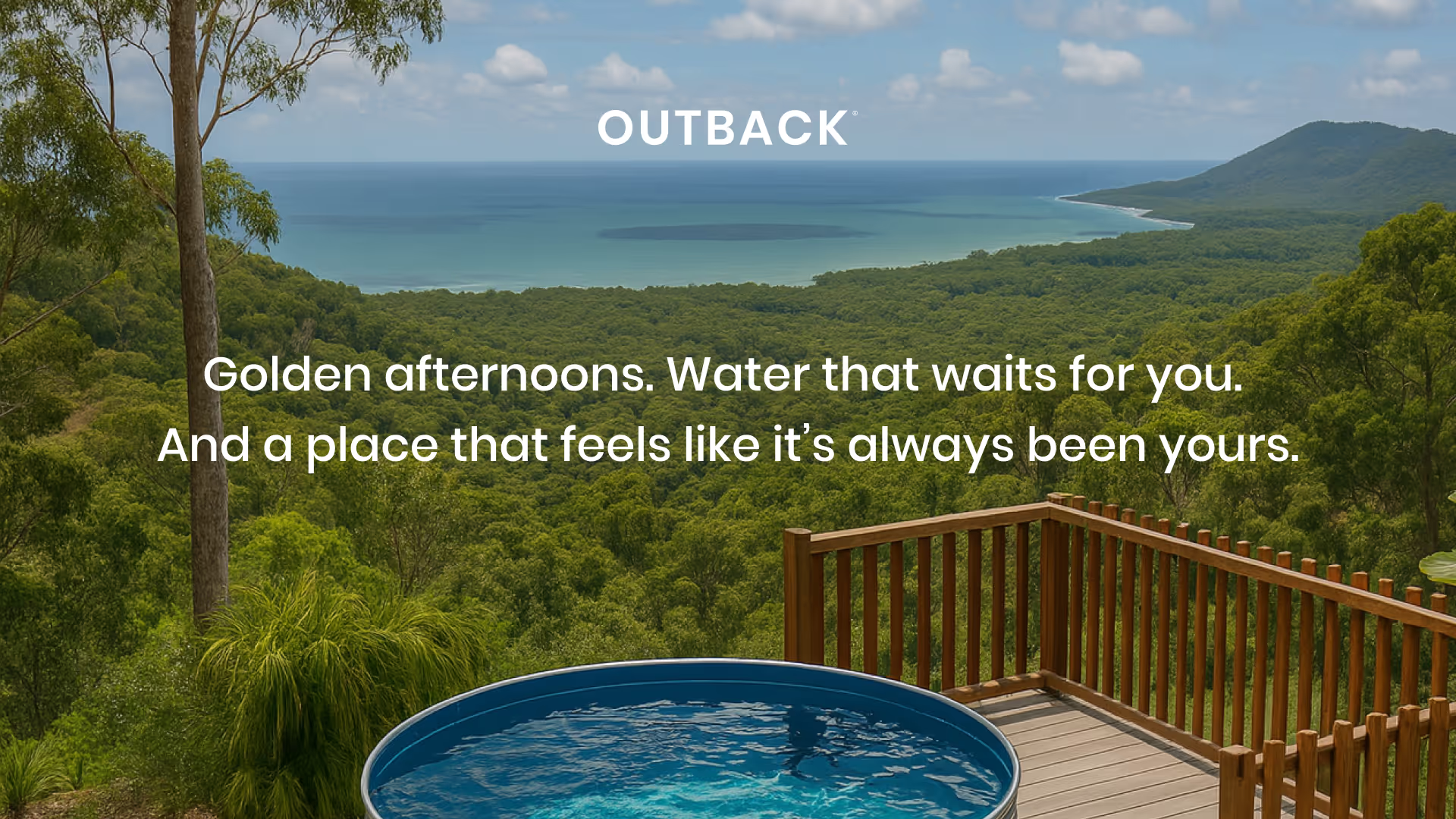
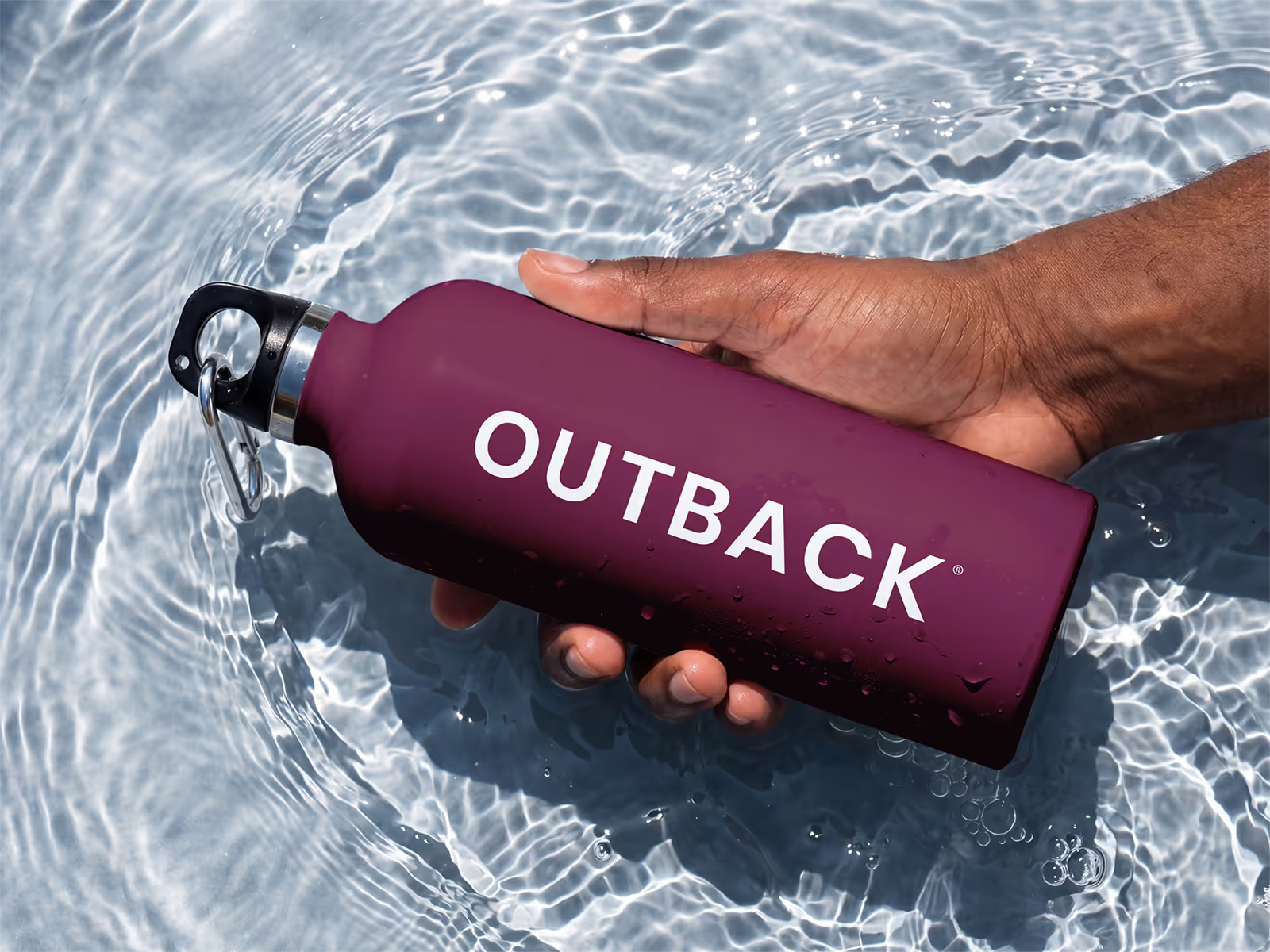
The identity work came last, and only because of what came before it. The brief wasn't to make something that looked premium. It was to make something that looked like Outback: Australian without being a cliché, confident without being loud. A colour palette named for the landscapes the product lives in. A brandmark built around the circular form that defines the product. Imagery direction that put real backyards and real light at the centre, because the aspiration was always attainable, never out of reach. The expression work extended all of it across every touchpoint, so Outback showed up at the same standard whether someone encountered it on Instagram or at a trade event.
A foundation for where it's going
Outback arrived at this engagement with hard-won knowledge and a product it had every right to be proud of. What it needed was a presence that matched that confidence. The team now has a style guide that travels with them, language they can use consistently, and a brand that has moved away from the common industry clichés toward something more considered. Every new conversation Outback walks into starts from a stronger position. This was always a refinement built to last.
"We knew it was time for a refinement that would carry our brand forward for years to come, and Studio Hakola delivered exactly that. Rebecca took the time to truly understand our business, our customers, and our goals. The result was a refined brand direction and style guide that has given our team clarity, consistency, and confidence in our marketing."
- Beau Rixon, Managing Director, Outback Plunge Pools


Start here if you're not sure.
Most people arrive thinking they need a logo, a new website, or better copy. Something visible and fixable. A logo built on unclear positioning is just a shape. A website built before the messaging is resolved is just an expensive page.
The surface stuff shows. But the surface stuff isn't the problem.