Captain Blankenship
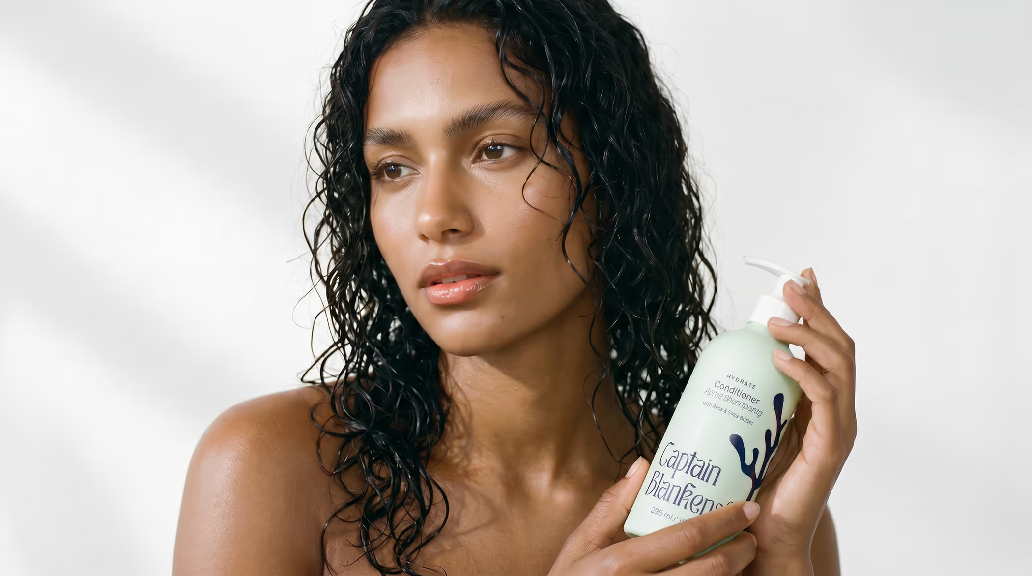
Wild by nature. Finally wild by design.
Captain Blankenship had been doing something rare for over a decade: building a haircare brand genuinely rooted in nature, not just positioned there. Founded in a kitchen in New Paltz, New York, the brand had earned a loyal following through plant-powered formulas, ethical sourcing, and a founder whose belief in wild beauty was as real as the ingredients she used.
By 2021, the brand was ready for its next chapter. A move to aluminium packaging, a sharper focus on haircare, and a founder who had always dreamed of a visual identity that could carry the full weight of what Captain Blankenship had become. The original logo had served its purpose with charm and authenticity. Now the brand was ready to build on that foundation.
A decade of substance, ready to show it
The credentials were real: B Corp certified, Made Safe, 1% for the Planet. Direct sourcing from farms and cooperatives. Multi-functional formulas designed to do more with less. A founder with a book, a community, and ten years of trust built on the belief that beauty and ethics weren't in conflict.
What the next chapter needed was a visual language and strategic foundation that could carry all of that clearly, consistently, and credibly into the market it deserved.
The work
The starting point was the brand foundations: why Captain Blankenship existed, who it was truly for, and what made it different from every other natural haircare brand on the shelf. A workshop process brought purpose, values, and positioning into focus. Beauty Wild With Nature wasn't just a tagline. It became the lens through which every decision that followed was tested.
The audience work went deeper than demographics. Captain Blankenship already knew their community was wellness-minded, conscious, and coastal. What the work uncovered was the psychology beneath that: why each customer buys, what stops them, and what earns their trust. Three distinct women, three different reasons to stay loyal. Understanding all three gave the brand a way to speak with precision rather than just reach.
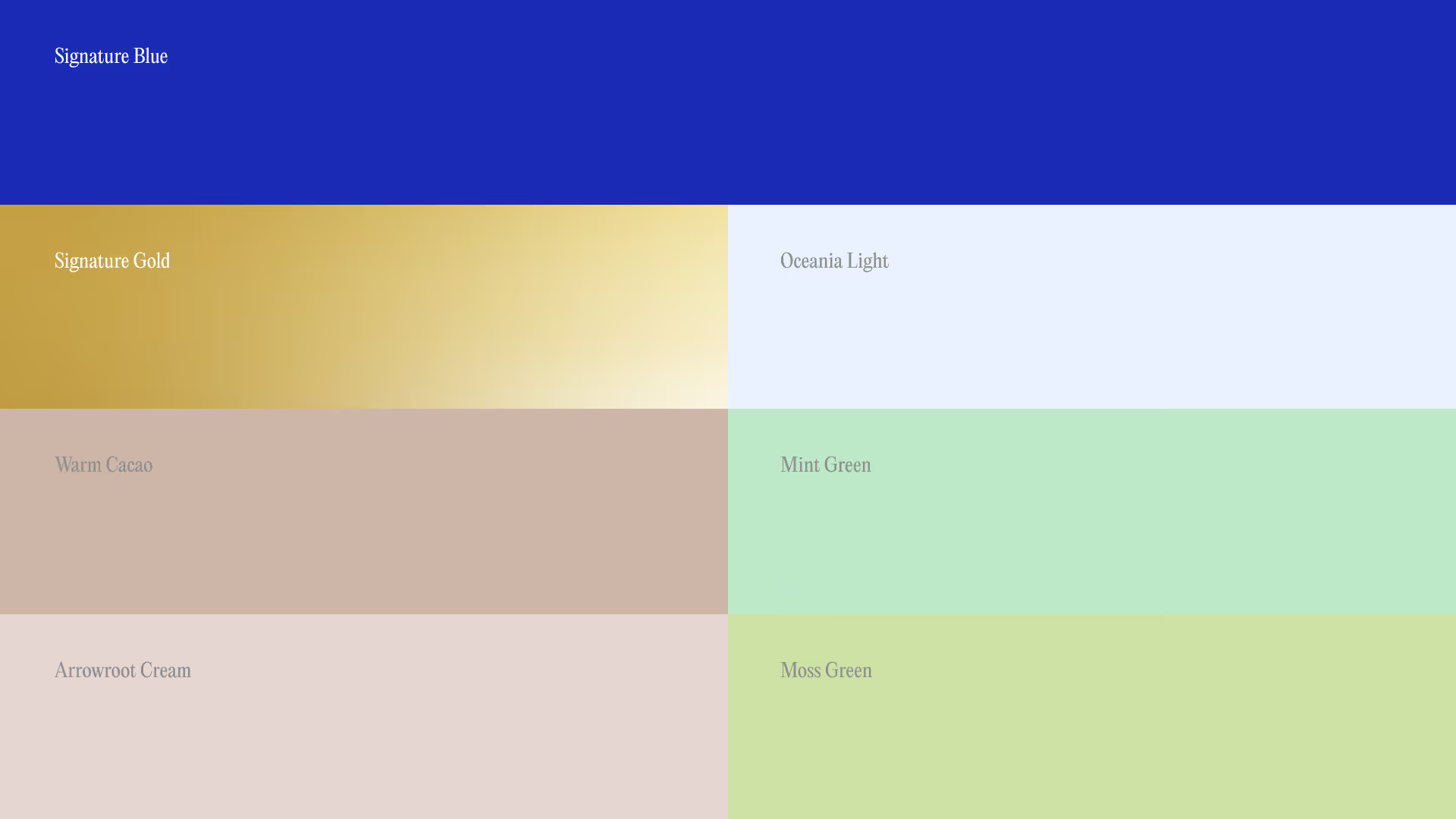
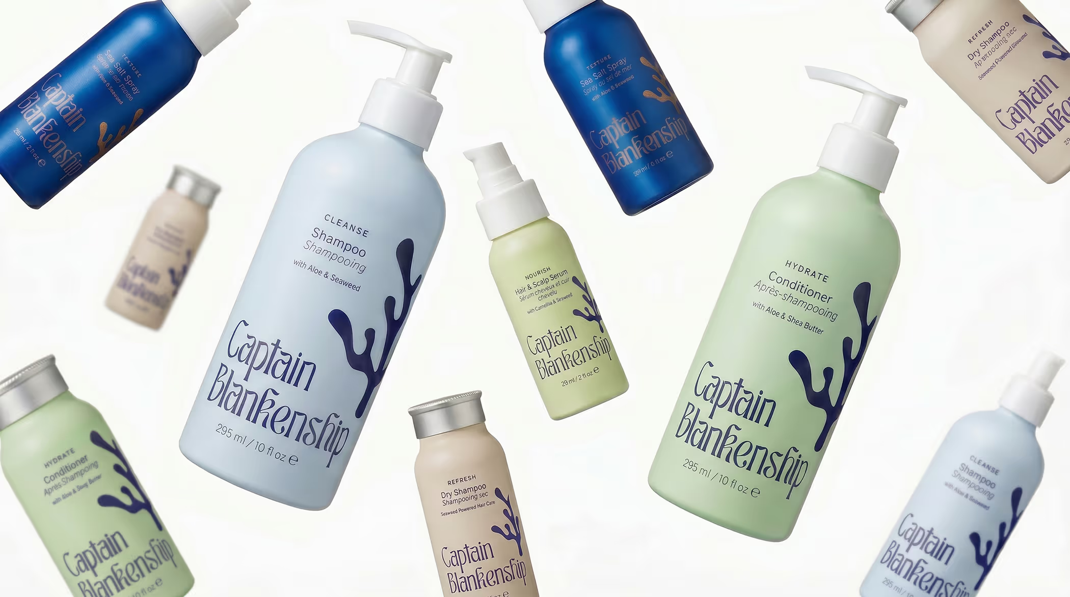
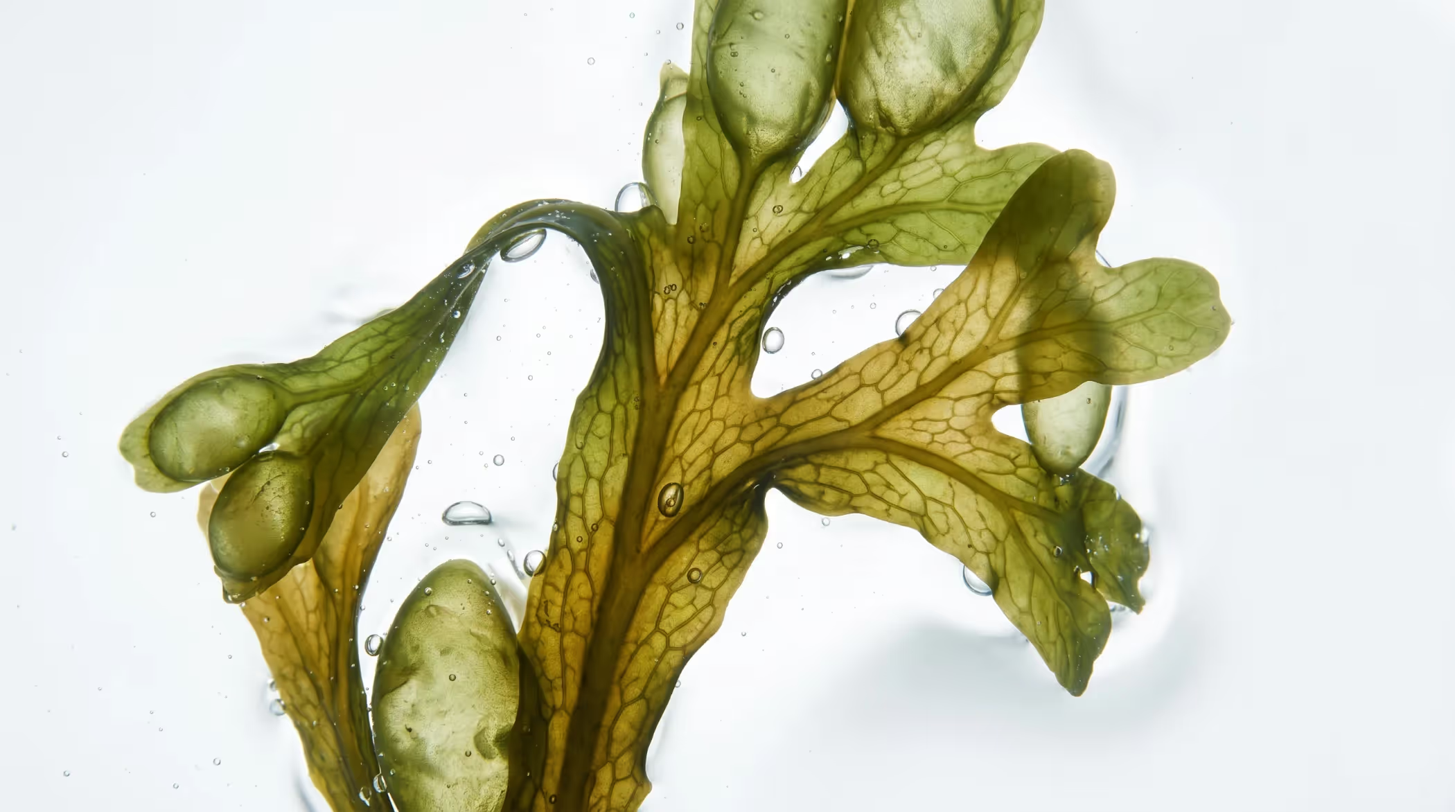
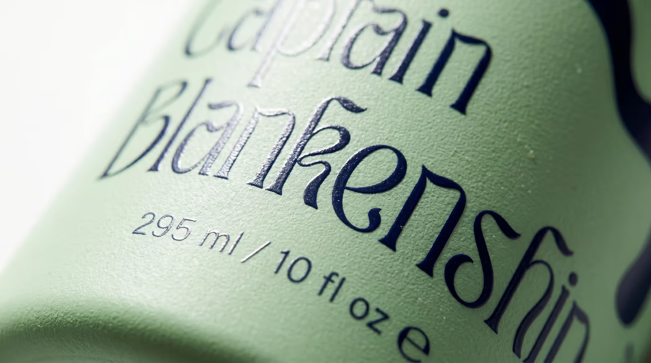
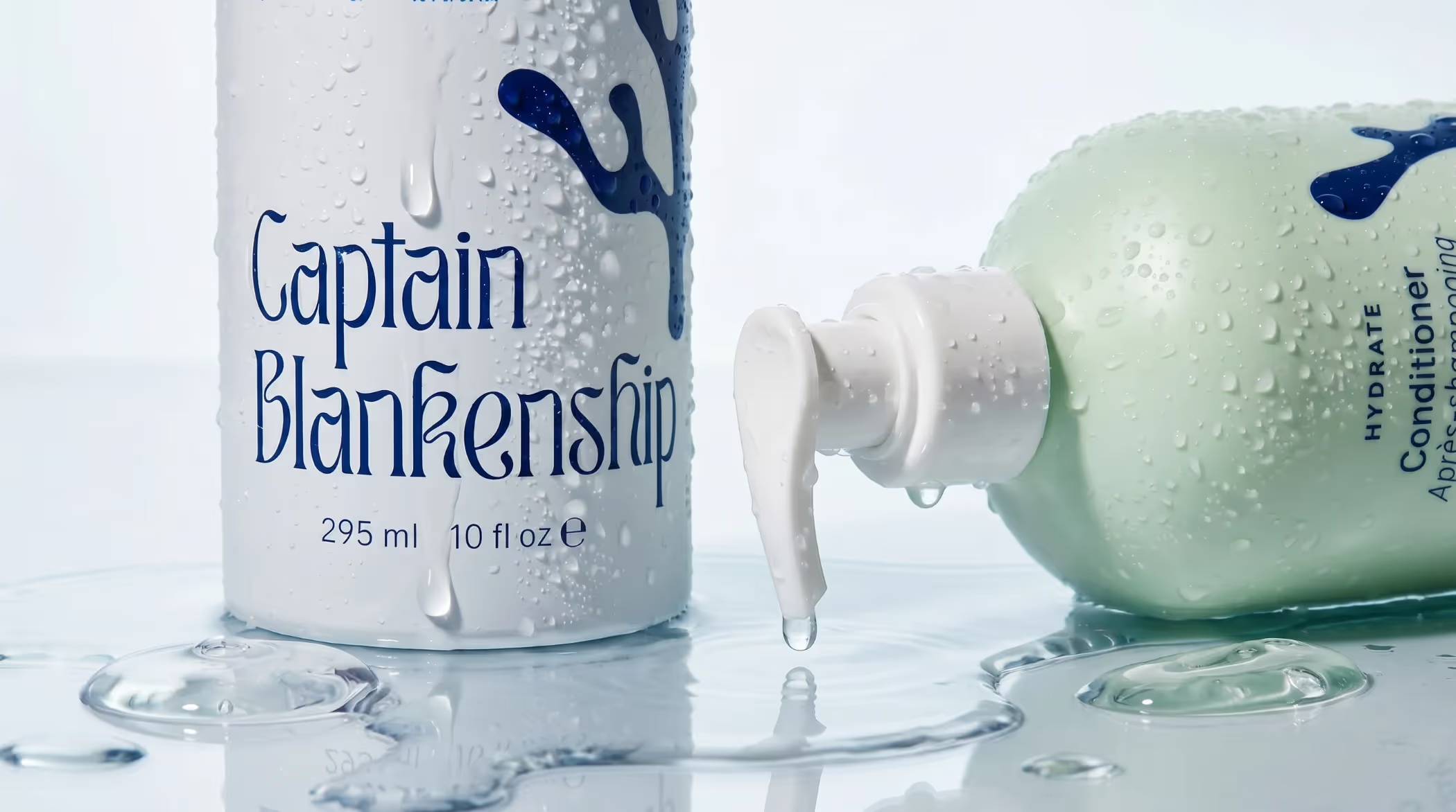
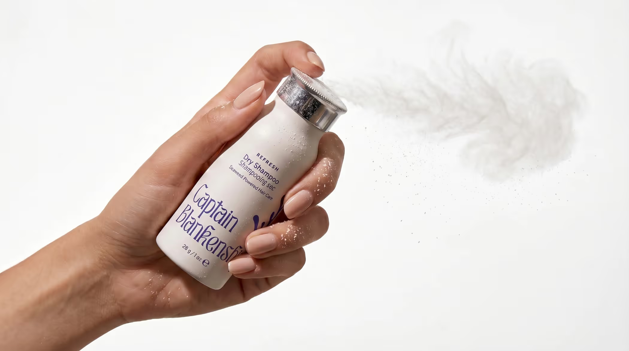
The identity translated all of that into something tangible. A fluid wordmark. Custom iconography drawn from Bladderwrack seaweed. A colour palette where every shade was pulled directly from the product's key ingredients, so each bottle in the range told its own story while belonging to the whole. The move to aluminium packaging extended the brand's values into the physical product itself, reducing waste without compromising presence on shelf.
A visual identity as intentional as the brand behind it
Captain Blankenship came into this engagement with ten years of genuine substance and a founder who had always known what the brand stood for. What the work gave them was the language and the visual system to make that visible to everyone else.
The strategic foundation meant every decision going forward had something real to measure against. The identity gave the brand a face that reflected its values rather than simply representing them. And the packaging put all of that directly in the hands of the people it was made for.
A decade of purpose, dressed to match it. And a brand that now understood its audience well enough to grow with them.
Start here if you're not sure.
Most people arrive thinking they need a logo, a new website, or better copy. Something visible and fixable. A logo built on unclear positioning is just a shape. A website built before the messaging is resolved is just an expensive page.
The surface stuff shows. But the surface stuff isn't the problem.